Tap, Tap, Taparoo - Web Development for the iPad


Full Platform Overview Chat With Us


Full Platform Overview Chat With Us


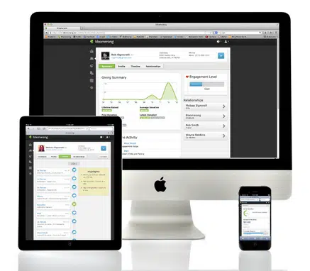
Let’s all hop in our time machine and go back to a time that few remember. It’s a sunny April morning in the year two thousand and ten, A.D. Around 300,000 patient line-waiters get their hands on the first generation of iPad – an event made all the more impressive by the fact that the news was often filled more with bad jokes about how the name sounded like a feminine hygiene product rather than what the device could actually do. Now, unless you’ve been in a coma for the past few years, you’re probably aware that tablet devices have become quite a big deal. In fact, about one in about twelve of you are reading this on a tablet device right now – a device in a market that didn’t even exist 30 months ago.
 But I’m not here to tell you news from the desk of Captain Obvious that the iPad is a really popular device. I’m here to ask the web application developers of the world “why are you ignoring this information?” Too much of the application development world still follows the same rules we did 3 years ago – rules that just don’t work for those of us using an iPad or similar device.
So your application looks great on a 1024×768 screen. It looks terrible for someone holding their iPad in portrait orientation… you know… the way most people want to hold their iPads. So you slap an adaptive layout in there so 3 columns becomes 2 and you’re done, right? Wrong!
Your menu navigation and most of the cool widgets in your application are dependent on poorly coded hover events to work. Now you have to update everything so that things happen when you click/tap instead of hover. Finally, your application is iPad-ready. Wrong, again!
Look at all of that stuff you tried to cram onto the screen. Aside from it being hard to locate where things are (a whole different topic for another day), you had to make all of your links and buttons really small to make sure everything fits. How many of your users have filed their index finger down to a fine point? I’m going to wager a wild guess that not too many of them have, so half of their user experience
is going to be accidentally tapping the wrong thing. Don’t worry. That won’t frustrate your users at all!
Everyone says that their applications have iPad support, but the truth of is that most of them really don’t. Supporting a tablet is more than just making sure that everything fits on the screen as long as the user turns it sideways. True support means that you build your software with the mindset that users interact with it differently on a tablet than they do on a laptop. Don’t treat these users as an
afterthought. If you do, you’ll need to change your layout, all of the UI components, and how you display things on screen (read: everything) so that you can properly support users who want to use a tablet. Accept that this is the new reality of web development and your users will thank you!
Comments