How to Set Up A Nonprofit Donation Page: 30+ Best Practices


Full Platform Overview Chat With Us


Full Platform Overview Chat With Us


Your online donation page is your virtual fundraising hub, providing donors with a way to support your cause from anywhere, at any time.
However, just because someone lands on your nonprofit’s donation page doesn’t mean they will make a gift. According to the M+R Benchmarks 2023 report, the average nonprofit donation page conversion rate is just 19%.
This guide reviews best practices to help you create an effective online donation page that drives conversions and boosts revenue. We’ll cover:
A donation page is an online form that nonprofit supporters can use to contribute funds toward your organization.
Donation pages allow supporters to give anywhere, at any time. These pages can help you reach a global audience with your organization’s mission. They also provide a secure way for donors to submit donations remotely rather than in person.
To reach a wider donor audience and keep up in today’s digital-first world, your nonprofit needs to have more than just a run-of-the-mill donation form. You need an optimized giving page that exceeds donors’ expectations and boosts your organization’s reputation.
Optimized donation pages offer multiple benefits, allowing you to:
If your donation page looks less than stellar, don’t stress! The next section explores tactical, low-lift tips to optimize your giving form and increase conversions.
We’ve grouped each best practice into the following categories:
Feel free to jump to a certain section if you’re looking for specific advice, or read through the full post. Let’s get started!
The structure and look of your donation page play a major role in whether supporters feel motivated to complete the form. Implement these best practices to develop a clean, engaging, and intuitive donation page design:
A robust nonprofit fundraising platform makes it easy to create and promote your online giving form. These platforms take the guesswork out of donation page design by offering tried-and-true templates that still allow you to fully customize your page to your organization.
Plus, they offer a variety of features for stewarding donors after they contribute using your online donation page. This includes sending donors personalized thank you messages and adding them to a new donor communications cadence.
Powerful online giving platforms like Bloomerang + Qgiv enable you to optimize your online donation process with:
If you’re interested in upgrading your online donation platform, think strategically about your options. Read reviews and testimonials and request demos for your top options. Make your final decision with the help of team members who will use the platform daily.
Use your donation page to remind prospective donors why you’re fundraising and what your goal is. Include a brief description of your fundraising purpose at the top of the page and a compelling image that highlights your mission.
For example, the ASPCA’s donation form includes a succinct description of the ASPCA’s mission to end animal abuse and neglect. It describes how donors’ gifts can help support that mission and make a difference for animals in need. Plus, it includes a carousel of suggested donation amounts with photos of different animals that the organization has helped.
This powerful combination of text and images sparks compassion and empathy in donors, encouraging them to follow through with their intention to give.
Connect specific donation amounts to different impacts that donors can make. This helps donors visualize how their donations actually make a difference. Plus, donors may feel encouraged to give more when they see the additional benefits they can bring to your organization’s work with a higher donation amount.
Take a look at a real-world example of this on the Nashville Food Project’s online donation form. The form lists four suggested donation amounts and how the organization uses those gifts:
These examples are powerful because they’re specific and descriptive. The donation page tells donors exactly how their support will fuel the organization’s mission and also provides an opportunity to review community impact reports to learn more about how donations are used.
Your nonprofit likely put a significant amount of time and effort into developing your branding strategy. You chose your logo, colors, and fonts deliberately to reflect your organization’s mission and values. Then, you incorporated your branding throughout your marketing materials, such as your website, social media, and direct mail.
Similarly, your online donation page should also be fully branded to your organization. A branded donation page reassures donors that they’re giving to the right organization. Plus, it helps spread brand awareness and recognition.
Include the following brand elements on your donation page:
For example, the Habitat for Humanity online donation page is branded with the organization’s logo, colors, and imagery:
While visual branding makes your forms easier to recognize, you should also include your organization’s voice on your forms. Include your mission statement on your donation page to inform people exactly what your nonprofit does to help the community. Tell your potential donors how their gift can make a difference in your efforts.
Keeping your donation form simple and short allows donors to fill out the form as quickly and easily as possible.
Only ask for necessary information such as:
This information is all you will need to process donors’ gifts and connect with them later to show appreciation and offer more ways to engage with your organization. Only collecting necessary information can also help keep your CRM less cluttered, making it easier to access important donor information.
Mobile users make up a growing number of online donation transactions, as well as 57% of nonprofit website traffic. Mobile-friendly pages also help your SEO results, making your donation pages easier for your donors to find online.
Look at your donation form in the mobile view to ensure there aren’t any formatting errors that could disrupt the mobile experience. Ask these questions as you review the page:
If you answered no to any of these questions, review and edit your donation page in the mobile view of your content management system.
Online accessibility is the process of making websites more inclusive by ensuring that people with permanent or temporary disabilities can use them. Accessibility is essential for making the web more inclusive, but unfortunately, 96.3% of website homepages have accessibility failures.
To increase your online donation form’s accessibility, design it with the Web Content Accessibility Guidelines (WCAG) in mind. These guidelines provide clear instructions for making your site more accessible. Here are a few examples of guidelines that apply to nonprofit donation pages:
By making your online donation form accessible, you ensure that anyone who wants to donate can do so without barriers. This can support your organization’s wider goals of making all of your opportunities, from donating to volunteering, more accessible for all community members.
Use A/B testing to assess how your audience responds to different donation page designs. A/B testing is the process of designing two different versions of your giving form and using website analytics to determine which page had a higher conversion rate.
Consider using different images, suggested donation amounts, and page formats (multipage vs. single page) to determine which options your audience responds best to.
For example, here’s what an A/B image test might look like:
Make sure to just change one page element at a time when conducting A/B tests. This allows you to pinpoint which changes make a difference.
Don’t underestimate the power of a clean, engaging, stylish page design. An aesthetically pleasing donation page can enhance your brand image and provide a better giving experience. Studies have even shown that 81% of people think less of a brand with an outdated website.
Consider incorporating evergreen design trends that make your page timeless. Elements like lots of white space, strong color contrast, and large buttons will always be in style because they’re both streamlined and user-friendly. Adding these elements will ensure that you don’t need to constantly update your giving form to keep up with fleeting trends.
The submit button is the most important call to action (CTA) on your online donation form. It’s the final button donors will click to submit their gift. It should stand out on the page and make it clear that by clicking the button, donors will send their funds to your organization.
Play with the wording and formatting of your submit button. For example, you might try different phrases, such as “Give Now,” “Submit,” or “Donate Now.” Conduct A/B testing to see if one type of wording leads to greater conversions.
You can also try different font styles or button colors to see which option leads to the greatest audience interaction.
Humans are visual creatures—we’re drawn to images, especially ones that feature other humans. Our brains can interpret visual information very quickly, making photos a useful tool to incorporate into your online donation page. Research shows that photos of people are particularly memorable, with an average memorability score of 82 percent, compared to photos of nature at 61 percent.
Choose just one compelling hero image to include in your giving form to remind donors who they will help through their gifts. For example, the Covenant House donation page includes an image representing the young people that the organization supports:
Including just one image keeps the main focus on the giving process while giving donors an inspirational reminder of what their gifts can accomplish. The goal is to create an emotional response to your cause without overwhelming your donors.
People are more likely to give if they feel the need for funds is time-sensitive. One way to encourage this sense of urgency is a fundraising thermometer, which helps your donors see how much more you need to raise for your campaign.
Including a fundraising thermometer on your nonprofit donation page increases your donors’ excitement and lets them visualize how much they can help your campaign progress. You can also embed your thermometer on different web pages to share your progress with more of your supporters.
Use a tool like Bloomerang’s free fundraising thermometer generator to develop a visual quickly and easily.
Your donation page should be streamlined, allowing supporters to complete the form as quickly as possible. Your form should also make it easy for supporters to maximize their giving if they want to. Use these tips to simplify the giving process:
Suggested donations are the giving amounts that you highlight on your donation form to give supporters an idea of the types of donations that will help your organization the most.
Offer a range of suggested donation amounts on your giving page. Base the lowest amount on your median donation amount to eliminate outliers, and set the other numbers at increasing intervals. For example, you might offer a suggested donation range of $25, $50, $100, and $200.
You can also use A/B testing here to determine the giving amounts that result in the most donations. For instance, you might run an experiment by setting two different suggested giving ranges and evaluating which range leads to a higher donation total. You might also try arranging your suggested donations from low to high and high to low to determine which arrangement yields more donations.
Social proof is the social-psychological idea that people imitate the behavior of others to conform to the “right action” in any given situation.
You can subtly incorporate social proof into your giving process to encourage donors to give in specific amounts.
Check out how the CARE online donation form highlights the most popular donation amount within their donation suggestions:
This strategy works because of social proof—the social-psychological idea that people imitate the behaviors of others to conform to the “right action” in any given situation. Giving suggestions make donors feel more comfortable with their donation choice.
Highlighting your most common donation amount can make your donors’ giving decisions even simpler.
Highlighting matching gifts on your donation page can be a great way to maximize supporters’ donations. Businesses with these programs match donations that their employees make to nonprofits and other charitable organizations. Companies usually match at a 1:1 ratio, but some match at a 2:1 or even 3:1 basis.
Help donors research their matching gift eligibility by incorporating a matching gift database within your donation process. Embed the database in your giving form, donation confirmation page, or a dedicated matching gift page on your website.
When donors access the database, they’ll research their company’s name to see if their employer offers matching gifts. They’ll be able to review the program’s guidelines, such as the minimum and maximum donation amounts, the match ratio, and employee eligibility rules.
Then, donors will view the next steps for how to apply for a match, such as the forms they’ll need to fill out. After they’ve completed these steps, your organization will benefit from the additional funding that matches will bring in.
You can make the process even simpler by using a matching gift tool that offers autosubmission. Rather than navigating to their companies’ gift-matching portals (which adds time and complexity to the process), donors just need to submit their company emails. The matching gift platform will automatically process the request.
These days, there are multiple payment options for all types of online transactions, from paying bills to shopping online. Your online donation form should be no different.
Depending on your donation page integration capabilities, you might offer payment options such as:
Some of these options may even influence donors to give more. For example, if a donor happens to have $50 in their Venmo balance, they might consider donating the entire amount rather than their initial choice of $30.
Offering a variety of payment options appeals to a wider range of donor payment preferences and helps make the donation process more convenient.
As mentioned, your donation page should be simple and streamlined to keep donors’ focus on giving. Avoid unnecessary distractions like:
These elements can distract donors from their intention to give and lead to a negative user experience.
Provide an option for donors to turn their one-time gifts into recurring donations on your donation page. This can be as simple as including a check box that says “Turn my one-time gift into a monthly donation.” For example, look at how the Michael J. Fox Foundation giving form prompts donors to make monthly gifts:
Offer a brief description of your monthly giving program and how it helps your organization. For instance, you might describe how your monthly giving program provides a reliable fundraising source in case your organization has to quickly respond to unexpected challenges. Also, describe any benefits monthly donors receive, such as free merchandise, early event registration, or exclusive publications.
It can be helpful to distinguish your monthly giving program from other fundraising efforts by giving it a unique name. For example, Doctors Without Borders calls its monthly donors “Field Partners.” This title makes monthly donors feel like true partners in working toward the Doctors Without Borders mission. To choose your monthly giving program’s name, consider how you can convey its fundraising purpose clearly and concisely through a unique name.
Load speed has a major impact on your donation page’s conversion rate. The likelihood that someone will bounce from your donation page increases by 32% when page load time goes from one to three seconds.
To ensure faster load speeds, enhance your donation page performance with the following tips:
Run your donation page through a testing tool like PageSpeed Insights to understand how it’s performing and identify necessary improvements.
Your payment processing tool is the platform you use to process donors’ gifts. A secure, reliable payment gateway enhances donors’ trust in your nonprofit. Enhance your donation page security with these tips:
It’s important to give donors agency throughout the giving process. When they know why your organization needs their data and what you’ll do with the information, they’ll feel more comfortable trusting your nonprofit with that data.
For example, check out how the Girls Who Code donation form keeps donors informed about how the organization uses email information:
The form lets donors know that the organization will use email information to send donors a donation receipt. It also allows donors to opt in or out from receiving future communications.
Avoid sending supporters to an unfamiliar third-party website to submit their donations by embedding your giving form directly into your website. This ensures that there are fewer steps involved from when a supporter decides to donate and actually completes the transaction.
Plus, when your online donation form is fully branded to your organization and integrated into your website, supporters will feel more comfortable giving you their sensitive payment information.
A payment processor is a digital system that allows you to manage financial transactions, such as online donations. Your payment processor should be easy to use, secure, and fully integrated with other tools, such as your CRM.
With a robust payment processor like Bloomerang Payments, you can benefit from features like:
With these tools, you can track donations and access donor information. Store this information in your CRM to follow up with donors and offer them additional ways to engage.
Donors are the end-users of your online donation page, meaning you should design the form with their preferences and interests in mind. Here are a few strategies for incorporating donor-friendly content into your donation page:
If you’re still deciding on a new online fundraising platform to invest in, look for a solution that allows donors to create their own accounts in a donor portal. With a donor portal, donors can manage their recurring giving, update their payment information, and view their donation history.
Donor portals give supporters more control over how they support your organization. These portals can also save your staff time since they won’t have to spend time updating donor information themselves.
Use your donation confirmation page or follow-up emails to describe the benefits of creating a donor account and provide instructions on how to do so. You can also allow donors to save their information after inputting it into your giving page to automatically create their accounts. This allows you to get donors into the system right after they make an online contribution.
The donation confirmation page is your organization’s opportunity to start building long-term relationships with donors, so you should use it to offer supporters additional ways to connect with your nonprofit.
Ensure your confirmation page includes:
Here’s an example of what your confirmation page could look like:
Remember, your confirmation page shouldn’t be the only place you thank donors—you should also send a follow-up email with a longer thank-you message that describes the impact of donors’ gifts, as well as a donation receipt. However, this page represents a crucial first step in the long-term donor stewardship process, so it should be considered an essential element of your online donation process.
When you use a robust online donation platform (like Bloomerang) to manage your online donation process, you can collect donor information from your giving form and automatically transfer it to your CRM. Then, you can follow up with donors using personalized thank-you messages that include donors’ names and specific donation amounts.
Here’s the information you can store in your CRM for future reference:
By storing this information, you can follow up with donors and continue stewarding them after they give online. This can lead to more donations from these supporters in the future.
Find a donation page tool that allows you to create customized fields for your donors, but keep your form as simple as possible. Offer custom fields for tribute or memorial donations to be made in someone’s name or create fields for additional details you may need to collect from your donors, such as volunteer options. For example, here’s an example of a memorial giving option on the Humane Society of Broward County giving page:
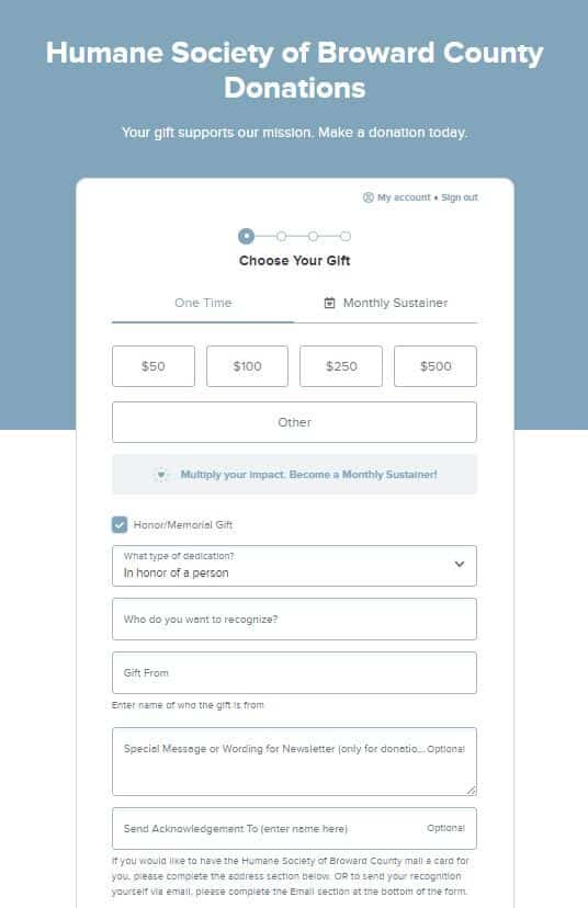
Another way to add custom fields while keeping forms easy to fill out is to use multi-step forms. Multi-step forms allow you to ask for information in chunks rather than in one long form, which makes the form feel less complicated for your donors to go through while still being able to collect extra information.
Your donors want to know where their money is going and how their generosity helps to further your cause. Give your donors the option to choose a specific project within your organization that they want their gift to go toward within your donation page. This ensures your donors’ gifts help the projects most important to them.
With a multi-restriction system, you can give your donors the option of picking further sub-restrictions within the project they decide to support. For example, if your organization works in different locations, your donors can choose which area receives the funds for the project they decide to support.
After designing an optimized online donation form, your work is not done. You’ll also need to find creative ways to promote the form to a wider audience. Try these promotional strategies to increase awareness and engagement with your donation page:
Google Ads are the sponsored search results that appear at the top of the page for certain search terms.
For example, take a look at this sponsored ad from the ASPCA that appears when you search “donate to animal shelter”:
Promoting your donation page via Google Ads is an effective way to reach an audience of people searching for terms relevant to your nonprofit’s mission.
As a nonprofit, you may also be eligible for the Google Ad Grant, which offers $10,000 per month in free Google advertising to qualifying organizations. Eligible organizations must hold 501(c)(3) status, have a functioning website with valuable content, and agree to the program’s requirements.
Optimize your Google Ad strategy by choosing high-volume, relevant keywords to target, creating compelling content for your ads, and tracking your conversion rate and click-through rate to assess your progress.
Include call-to-action (CTA) buttons on your homepage, blog posts, about page, and event pages that lead users to your online donation form.
Ensure these buttons are bold, with contrasting colors and compelling text urging website visitors to “GIVE NOW” or “DONATE.”
Take a look at this effective example from the Freedom Service Dogs of America website:
The large, red “DONATE” button stands out against the white background and smaller main menu items at the top of the page.
The more platforms you use to share your donation page, the more potential donors you can reach. Promote your digital donation form by:
This gives donors plenty of ways to connect, whether they’re using their mobile device or laptop or checking the mail.
Incorporate social media sharing buttons that make it easy for supporters to share the page with their networks. For instance, as mentioned, your donation confirmation page should offer social media buttons so donors can share their donations with their family members and friends online.
Incentivize donors to share your donation link by commenting on their posts to thank them or entering their names into a prize drawing.
In addition to promoting your giving form in day-to-day social media posts, emails, and letters, you can also include it in specific fundraising campaigns to drive revenue.
Link to the form throughout fundraising initiatives such as:
You should also encourage supporters to share your donation page link when you’re hosting an online campaign, such as a peer-to-peer fundraising campaign or social media video challenge.
After a donor gives for the first time via your online donation page, use their contact information to start forming long-term relationships with them.
Keep donors engaged by:
Stewarding new donors is an essential part of retaining them for the long haul. Personalize your messages to new donors using their names and referencing their past interactions or donation amounts. This shows donors that your nonprofit sees them as individuals.
Now that you’ve reviewed essential best practices to keep in mind for building your donation page, you’re ready to start designing the form. But how can you turn your plans into reality?
Setting up your donation page first requires investing in an online donation platform that enables you to create an unlimited number of fundraising forms with the help of a user-friendly interface. We recommend Bloomerang + Qgiv, a powerful platform that combines the best of donor management and fundraising tools into one intuitive system.
Follow these steps to use Bloomerang + Qgiv to design your compelling donation page:
Qgiv enables both styles—either option can work based on your preferences.
Use the best practices above, such as basing suggestions around your median donation amount, to set reasonable suggestions on your giving form.
Qgiv enables giving frequencies of weekly, every other week, monthly, quarterly, semiannually, and annually. You can choose to offer all of these options or just a few.
Add your logo, brand colors, and a background or header image.
You can add custom fields to the second step of the form (called “donor details”) or the third step (called “additional details”). We recommend including just one or two custom fields to keep the form streamlined. Choose from multiple field types including free-form responses, checkboxes, drop-downs, and multiple selection. Ask supporters anything you want to know about, whether their interest in volunteering, their T-shirt size, or their dietary restrictions.
Show donors the true impact of their gifts by adding real photos that illustrate the positive effects of giving at different levels. For example, you could show an image of one child being helped for your lowest donation amount and a photo of a group of children for your highest suggestion.
Make your confirmation page more engaging by adding images, a video, and social sharing widgets.
Customize your email receipts by adding images, incorporating your branding, and featuring a unique, compelling subject line. You can also use tags to automatically input donor information like their names and gift amounts.
Qgiv users who embed their donation forms into their websites see a 2.4x increase in overall donation conversion rates, one-time donation conversion rates, and recurring donation conversion rates.
The way you design and promote your nonprofit’s donation page can have a major impact on your overall online fundraising success. A strong donation page drives donations and sets the stage for future donor engagement.
If you’re looking for more tips on optimizing your online fundraising process, check out these additional resources:
Comments
Joseph oese