The Facebook Page Donate Now Button Is Dumb and I Hate It

Full Platform Overview Chat With Us


Full Platform Overview Chat With Us


Update: Facebook has announced a new suite of fundraising & donation pages for charities >>
When the new Facebook Page Donate Now Button was released globally, one blogger opened up her announcement article by saying: “This new Facebook feature is hard not to like.”
Well, I’ve got some bad news for you. I’m going to be that guy.
Readers of this blog may already know that I’m not crazy about Facebook marketing for nonprofits in general. In my opinion, the dangers of digital sharecropping are too great, and ad grants represent an unnecessary and dangerous distraction.
While most charities use the network as just another promotional bullhorn, Facebook remains a woefully underutilized method of donor and volunteer appreciation.
And now we have yet another digital acquisition tool in the form of the “Donate Now” call-to-action button that nonprofits can now place on their Facebook pages.
Here’s how it works: the next time you, as the page admin, visits your page, you’ll be prompted with this message:
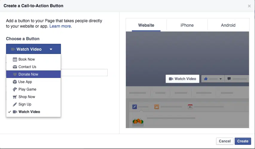
After clicking “Create Call to Action,” you can select the type of button from a drop-down menu. Pages categorized as a “Non-Profit Organization” can select “Donate Now.”

Finally, you can designate a URL for the button to point to (paste in your donation page URL):
And, voilà, you have a Donate Now button on your Facebook page.
In my mind, this button is problematic for two reasons:
1) This is an obvious ploy by Facebook to get you to buy ads
Look what you’re prompted with right after you set up the button:
Your new button now beckons you to create an ad:
Not exactly a shining beacon of altruism from Facebook.
It’s no secret to marketers that their Facebook posts remain unseen by a majority of their intended audiences without a paid boost.
Will your ad generate enough donations to offset the cost? Don’t forget, the button only gets them to your external URL – there’s no guarantee they’ll follow through and complete the donation form.
Is this the best use of your budget?
2) There is no organic path to the donate button that makes any logical sense or has any basis in reality
Let’s say you don’t buy any ads that drive clicks directly to your Facebook page. To click the Donate Now button, they would have to arrive on your page organically within the social network, or by an outside referral.
But why would you direct people to your Facebook page in order to make a donation? Why not just direct them to your donation page via a compelling post or shared link?
Maybe you’re thinking “Well, someone might end up on our Facebook page for whatever reason, and then make the decision right then and there to make a donation.”
But would that ever really happen?
Would someone see a post (either from your Facebook page or one that mentions you), click-through to your page, and read or view something there that is so compelling that they would click the Donate Now button?
I don’t buy it. It’s the equivalent of a coffee shop putting their tip jar outside and around the corner.
And to assume that having this button there suddenly breaks down a barrier to giving that was previously there is a stretch.
At best, it signifies a lack of imagination and understanding of the fundraising profession on the part of Facebook. At worst, it’s a cash-grab that flies in the face of the fundraising expertise built up over many years by practitioners who have mastered the craft of compelling, heartfelt appeals and effective donor stewardship.
So should you set up the button?
Probably. There’s really no downside per se and the whole process takes less than a minute.
If someone, somehow stumbles to your donate form through that button and makes a contribution, well golly, good for you. I’ll eat my hat. But I wouldn’t bet on it, and I certainly wouldn’t spend any time trying to drive prospective donors through that giving path or purchase any ads.
What do you think about the new Facebook Page Donate Now Button? Have you set it up? Have you gotten any donations? Let me know in the comments below!


Comments
Fundraising Friday | September 4, 2015 | Pamela Grow
Charles Franklin
John Haydon
Steven Shattuck
Carolyn M. Appleton
Is the Facebook “Donate Now” Button: Dumb or Helpful? | Michael Rosen Says...
Jonathan Assink