


ARTICLE
The 5 Elements of a Great Nonprofit Logo

“A company’s logo is its shorthand, a visual cue that tells a story of the brand’s culture, behavior, and values.” – Su Matthews Hale, Senior Partner at Lippencott
Think about some of the big brands in the world. McDonald’s. Apple. BP. Starbucks. Coca Cola. Walmart.
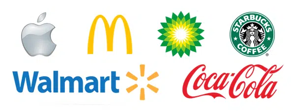
How long does it take you to imagine these brands in your head? You can probably visualize their logos in an instant upon saying their names. That shows the power of a great logo.
These companies have created logos that have the ability to be recognized internationally, for the most part, even without their name attached. When you see the “golden arches” while driving down the interstate, you know it’s a McDonald’s. When a laptop has a glowing apple on it, you know it’s a Mac.
“A logo is a simple and functional signpost to help people find and identify your business” said Rebecca Battman, an independent brand consultant.
There are five essential elements to consider when creating your logo:
1. Appropriate: Your logo should be appropriate to what your organization represents.
2. Memorable: Will people remember it when they see it?
3. Uncomplicated: Less is more. Don’t try to be too complex.
4. Original: Research, research, research! Make sure you’re the only one with your logo design.
5. Timeless: Choose a font/style that will still be in style 10, 20, or 30 years from now.
Over two thousand years ago, Aristotle said “The soul cannot think without a picture.” Nonprofits need great imagery and well thought-out design bundled up in a small icon to represent their organization. This is how great logos are born.
Did you know that colors have a huge impact of how people perceive your logo? Using different colors as your primary logo color can drastically change the message that it’s transmitting, as explained below:
The font you choose for your logo is a critical decision that determines the identity of your logo. It’s something that can drastically change your audience’s perception of what your organization is about.
There are a few important aspects you should consider when choosing your logo’s font:

“Your logo should be front and center in any venue where you interact with customers,” says Andrew Coulter, senior marketing director of MushKush Integrated Marketing. “You’re not really branded until everybody knows your logo and associates it with you.”
Mr. Coulter is absolutely right – if you have a great logo, don’t be afraid to show it off! The opportunities to display your logo are limitless, and as a nonprofit you should focus on creating a strong brand awareness so people will know who you are. Large nonprofits like Unicef, the American Red Cross, and the Salvation Army all have logos with a powerful presence that can be recognized despite the country, language, or format with which it’s portrayed. Here’s our short list of design ideas to help you build your nonprofit’s brand and showcase your logo:
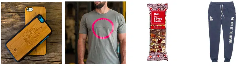
Charity: water, Barbells for Boobs, To Write Love on Her Arms, and This Bar Saves Lives do a great job of using their products to display their logos, as seen below.
Now that we know a little more about what makes a great logo and how you can use it, your nonprofit should seriously assess whether or not your logo is effectively representing your organization or if it’s time for an upgrade.
Remember that your logo should provide people with a glimpse into your organization – a visual cue as to why they should care about you. Ask yourself if your mission and values are coming through the design and if it’s easily recognizable to your donors. Decide today if your logo is being used to its full potential and is benefiting your organization. And if you need some extra inspiration, check out the best nonprofit logos here.


Comments