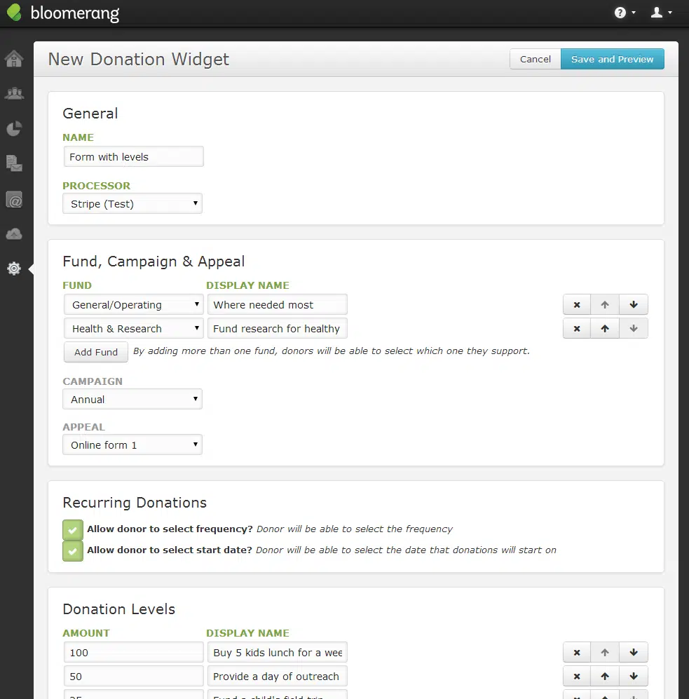
We recently released a significant update to Bloomerang – the ability to customize and manage widgets directly within the system! This means that now you can go in and customize the options and questions that are presented to donors when they click that prominent “Donate Now” button on your home page. Here’s a quick list of the features that are now available:
- Allow donors to allocate their donation to a specific fund
- Define suggested amounts for donors to select when donating
- Let donors choose the frequency and start date of their recurring donations
- Add custom fields as “questions” to your widget (either donation or email signup)
- Select a processor to use with each widget
So, what does this mean? Let’s say you are a community center and decide to spin up a new program for soccer (this is World Cup time, after all). You can add a new fund in Bloomerang that allows donors to select when making a donation. You could also add a field for them to check off their interests (which you have stored as a custom field on their profile so you can filter & report on it later).
Or let’s say you’re launching a capital campaign. You would set up your communication strategy, but along with that, you need a landing page specific to the emails you plan to send out. You can now create a widget unique to that campaign that uses a second processor account you set up (so the funds are deposited in your campaign-only bank account). Donors can select amounts to give based on the sponsorship levels you’ve defined, and they can give you valuable feedback on some of the reasons they’re contributing (stored as a transaction custom field so you can then filter & send a customized thank-you specific to that emotional driver).
You can see a donation form in action here.
Now, one word of caution. Just because you have the power to add all the custom fields in your database to a form doesn’t mean you should. After researching 40,000 contact forms, Dan Zarella of HubSpot reveals that conversion rate improves by 50% when the number of form fields reduces from four to three. Apply that logic to a donation page and it’s easy to infer that you should only include fields on the form that are absolutely necessary for your organization to fulfill your commitment to the donor. Here are some other things to consider when building your page:
- You should show how much of their donation goes directly to the program they’re supporting (“$8.74 of a $10 contibution goes directly to . . . “)
- Test multiple forms. Try spinning up forms with different wording, placement, or donation levels, and test their effectiveness by tracking a unique appeal for each one.
- Write giving levels that explain what the amount will do for the mission. You don’t want to say “$100 – Gold”, you want to say “$100 – Feed 5 homeless children lunch for a week.”
Enjoy!


Comments