I’d first like to introduce myself, Hi! I’m Chelsea, the Sr. Product Designer at Bloomerang. I’ve been designing products since 2012 and I have been with Bloomerang for a little over a year. I love making experiences for humans on the web that feel organic and natural, I also am passionate about making those experiences accessible for all users.
The main ingredient in designing products is the user. I want my users happy, relaxed and confident. I want to put you at ease by letting you know Bloomerang isn’t changing overnight. When you logged in today you probably noticed some changes, but rest assured, everything is in the same place. We want to bring our application to the next level and we want to help users at the same time.
Web 2.0
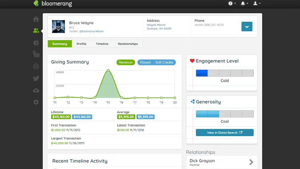
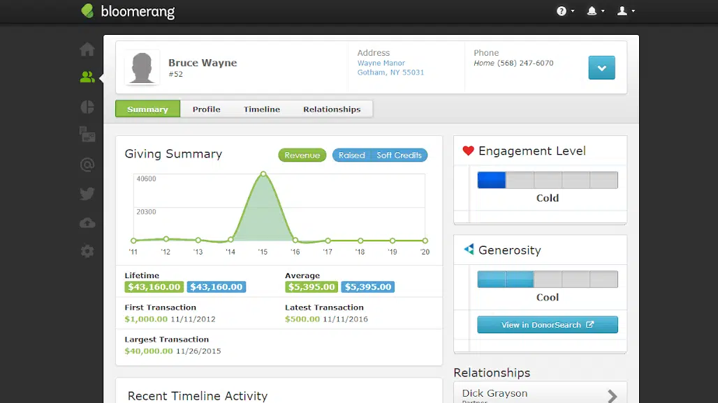
The current design of Bloomerang is heavily influenced by a moment in web design called Web 2.0. This is the shift in the internet to a more user-friendly and focused design. It’s a great shift as accessibility increased for all users. The visually rich interfaces from that shift are now seen as overwhelming and mentally taxing. Categorically the “look” of Web 2.0 is reflections, metallics, glassy gradients, LARGE TEXT, rounded corners and green. There are of course the technicalities of Web 2.0, and I won’t get into that, but for designers there was a shift, we felt it, we saw it and we designed for it.
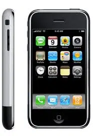
A great example of this would be the first iPhone, whether you had one or not you know the design style I’m talking about. Things had a “real feel” to them there was almost a need for things like a settings cog to look metallic, the sheen of metal was there or the Notes app that was a yellow legal pad. They designed these things to look like the “in real life” counterpart so that your brain made the connection. Think about where you take notes now? What settings look like now? What about where you access your calendar from? Slowly you have been trained to simplify those images into simpler metaphors.
So what does this mean for Bloomerang? The changes you see today are the first step in maturing our design through a series of visible and distinct changes as well as subtle and nuanced changes to make your experience the best.
Color defined
We are refreshing and standardizing the color palette! Designing with specific colors helps users know what to anticipate. When you see green generally we know it means go, good, positive things, and when red is present oftentimes there is an error that needs mitigating. You anticipate that because of all the user experiences you come in contact with on a daily basis. Our brand colors are green and green and a funny thing about green is that it is the unofficial color of Web 2.0; instead of the blues and greys from the beginning of the web, green was a fresh, friendly take on user experience. It has several positive connotations that we often don’t even have to think about. It might not be perceptible to all users, but within the app there were more than a handful of greens. So we are going to standardize green and get it on brand. I want to make things easier on everyone’s eyes, lifting and aligning all the colors in the app allows us to have more flexibility when solving user’s needs and creating the best experience.
Finding our font
We have a font change! Quicksand is a display ready font that modernizes the application while giving every user the same experience across devices. This font has an element of whimsy with the extra curve in the tails of Rs and Qs. Importantly the dollar sign is clear as the middle strikethrough line goes all the way through the ‘S’ and the top and bottom are distinct. The impact of changing to one font style means that we, as a team, can plan and design consistent experiences for users. Prior to this change our application used Century Gothic and Verdana, both of which are highly regarded for their accessibility, but are lacking in the consistency we need. With accessibility at the forefront, we adopted Quicksand.
Updated Quicksand font family
Original Verdana font family
Grappling with gradients
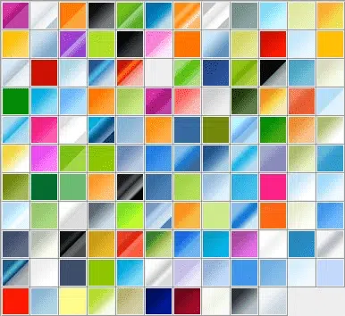
Very popular in Web 2.0 would be the use of gradients, this was a modern, “real feel” mechanism, could be evoking a “glass” button or the sheen of metal. This dated look has all but disappeared from the web. Once used to create depth, gradients can be seen as accessibility-friendly or not. The nuances of a gradient can be indistinguishable to some users. Gradients have gained a new life in all design circles, they evoke emotion, passion, knowledge, and they are used to relax the eyes in many single-page scroll experiences. Since we have a specific viewing area we want to get rid of the weight that comes with the overuse of gradients, on greys, whites, and blues. We will be sunsetting their use throughout the app.
Accessibility first approach ?
Every decision I make is with accessibility at the front. According to the WHO, about 15% of the world’s population has some form of a disability. Everyone should be able to use the web and access the same information regardless of ability. Often we see a beautiful design on the web, but what we may not realize is how that experience translates to all users. As things improve and change within the app they are all done through the lens of accessibility.
This is just the start of simplifying the interface and increasing accessibility for users. It’s an exciting time to be a Bloomerang user, the vision for the future is a user-friendly, responsive and accessible app. I want it to not only be visually pleasing, and enjoyable, but also robust in functionality. I want you to know you are “at” Bloomerang and you feel our friendly, guiding presence screen to screen. We are really thrilled to give ourselves a lift and help our users at the same time!




Comments