ARTICLE
15 Things Fundraisers Can A/B Test to Increase Donations


Whether you’re just finishing up a new web design overhaul or working with a website that has existed in its current state for years, A/B testing is a great way to ensure that your website gets visits and generates conversions.
A/B testing, also known as multivariate testing or multi-variable testing, is the process of testing multiple versions of a single digital asset in order to find out which version performs the best.
Some sophisticated marketing automation software programs and website content management systems will allow you to test multiple variations of text or a button at the same time. Users will randomly see one while other users will see another.
Even if you don’t have access to these kinds of tools, you can still test things manually by swapping out website assets and varying your emails. Here are 15 things you can A/B test to increase clicks, conversions and donations:
1. Delivery date
2. Delivery time
When you send your email can have a significant bearing on its open-rate. Keep in mind where a majority of your subscribers live (timezones) and where they work (are they in an office all day? do they work at night?). Keep in mind that some people check email in the evenings on their mobile devices.
Note: there’s a lot of data, studies and opinions about when the best date and time are to send an email, and they all vary wildly. The best way to know for sure what works best for your organization is to test and retest until you find out for yourself.
3. Subject line
Since the subject line is the first thing an email recipient will see, it must be compelling and eye catching. Don’t be afraid to experiment widely here. During the 2012 elections, the most effective email subject line for the Obama campaign was “Hey.”
4. Button text
5. Button size
6. Button color
7. Button shape
Button testing is an often-ignored exercise, but one that can pay off massively for your organization. “Donate Now” is a pretty standard button, but have you ever considered trying “Support Us?” You could also try something tied closely to your mission, like “End Hunger.”
Colors also have an interesting psychological effect on users. Check out this color image guide to see what emotions are triggered by certain colors:
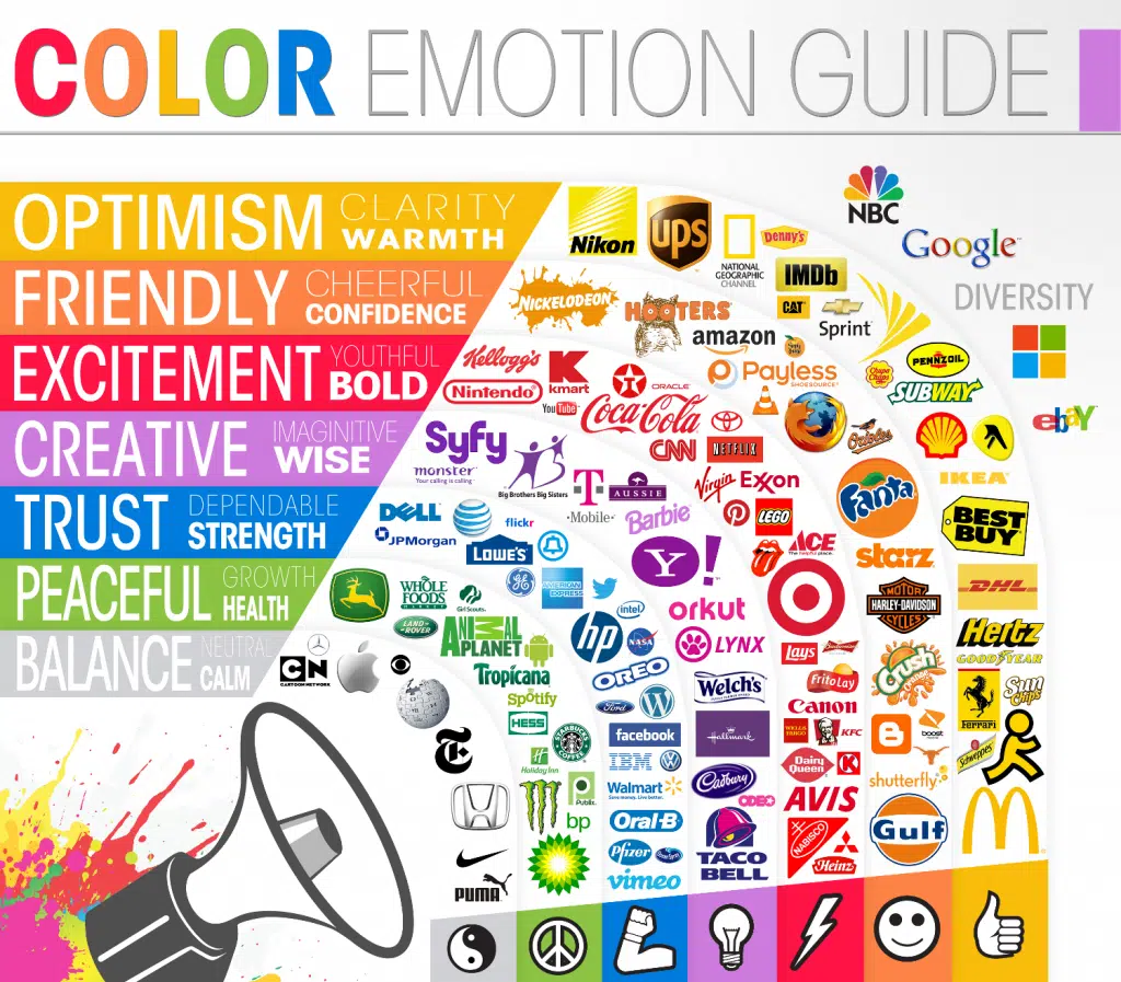
Do keep in mind the action that the button makes: is it a donation or a volunteer sign-up? Which emotions correspond best? Be sure also to make sure that the color matches or compliments your branding.
Want to A/B test your buttons right away? Download our free Donate Now Button Kit >>
8. Headlines
9. Paragraph text
10. Images
11. Calls-to-action
The text and images on your page can have a huge effect on whether or not your sign-up and donation forms get filled out. Be sure to test headlines, paragraph text and any images. Consider placement and arrangement as well. Make sure nothing distracts from or pushes the form below the fold (you don’t want people to have to scroll to get to the form).
CTAs, or calls-to-action, are also very important to consider and test. These, like buttons, should be compelling and encourage an action. User experience is paramount here. For example, “click here” as a text link isn’t a great CTA, since some of your visitors may be using a mobile device. Plus, it’s not very compelling. As with your buttons, try something like “give now” or “support us now.”
Note: all four of these items also apply to emails. Test, test, test!
12. Form length
13. Field size
14. Field questions
15. Premiums
Your forms themselves can also be tested. Keep in mind that the shorter the form, the most completions it gets typically. Don’t ask too many questions, or you might scare off the website visitor. You can also test the verbage of the questions themselves. What happens if you ask for “Phone Number” instead of “Cell Phone Number?”
If you offer premiums, you can test different options. If you don’t offer premiums, what would happen if you did?
If you feel your website isn’t quite performing, try changing a few of items listed above and see what happens. Even if they perform worse, you can always switch it right back.
What have you A/B tested at your nonprofit? Let me know in the comments below!
Want to A/B test your buttons right away? Download our free Donate Now Button Kit >>


Comments
Steven Shattuck
Ellen